
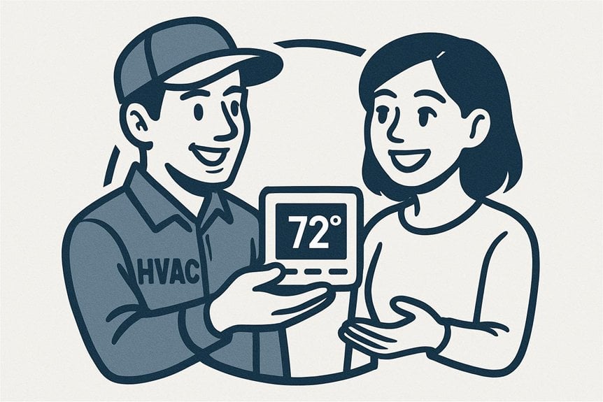
You need logos that signal HVAC fast: pick a clean, silhouette-first icon (fan, flame, snowflake, or wrench) plus a simple airflow accent so people recognize your service instantly. Use a trust-building palette—deep navy, neutral grays, white—with a vivid accent for CTAs, and choose bold, high-contrast typefaces that read on trucks and shirts. Provide full, stacked, and icon-only marks, local trust badges, and A/B-test taglines and CTAs to boost calls — keep going to see practical examples.
Key Takeaways
- Use a bold, silhouette-first HVAC icon (fan, flame, snowflake, wrench) for instant recognition at small sizes.
- Provide three scalable marks (full, simplified, icon-only) with clear-size rules and vector + pixel exports.
- Choose a trust-building palette (deep navy, neutral grays, white) with one vivid accent for CTAs and accessible contrast.
- Pair a readable, high-contrast typeface with short benefit-first taglines like “Fast Fixes, Lower Bills” and clear local cues.
- Test one brand element at a time (color, icon, tagline), track CTRs and leads, then iterate on the proven winner.
Clean, Recognizable Iconography That Communicates Service
Choose simple, bold shapes that immediately signal HVAC—like a stylized fan, flame, snowflake, or wrench—so customers instantly know what you do. You’ll pair those icons with clean lines and balanced negative space so the mark reads clearly at a glance, even on truck decals or app icons. Focus on silhouette-first design so the symbol stays legible when scaled down. Avoid intricate details that blur in embroidery or favicons.
Combine one clear icon with a restrained secondary element—a subtle airflow curve or a single temperature droplet—to hint at services without clutter. Test icons in monochrome to confirm contrast and in tiny sizes to make sure recognition. Iterate quickly based on real-world mockups, not just screen previews.
A Trust-Building Color Palette With High Contrast
Because customers often judge professionalism at a glance, pick a high-contrast color palette that signals reliability and makes information instantly readable. You want colors that boost trust—deep blues, neutral grays, crisp whites—and a vivid accent for calls to action. Use contrast to improve legibility on vans, uniforms, and digital assets without relying on heavy effects.
| Primary | Secondary |
|---|---|
| Deep Navy | Cool Gray |
| Pure White | Accent Orange |
| Charcoal | Soft Blue |
| Steel | Accent Teal |
Apply primary colors to large surfaces, secondary for supporting elements, and accents sparingly to draw attention. Test palettes in sunlight and on screens, and keep accessibility in mind so your brand reads clearly for every customer.
Bold, Readable Typography for Trucks and Uniforms

You’ll want high-contrast font choices so names and numbers pop against vehicle paint and uniforms.
Pick scalable letterforms that stay legible from a distance and when reduced for business cards or patches.
Use durable material printing to keep sharp edges and color contrast through weather and wash cycles.
High-Contrast Font Choices
Make bold, high-contrast typefaces your go-to for trucks and uniforms so your brand stays legible at a distance and in motion.
Choose fonts with strong weight differences between strokes and clear counters so letters don’t blur when viewed quickly or under varying light. Pair a dark, saturated color with white or pale text, or reverse that scheme for night visibility.
Avoid delicate scripts, heavy ornamentation, or thin condensed styles that collapse at small sizes or on textured surfaces. Test color and weight on vehicle wraps, reflective vinyl, and embroidered patches to confirm clarity.
Stick to one or two complementary typefaces to maintain consistency across fleet and crew, and make certain instant recognition on the street.
Scalable Letterforms
Think with respect to distance and motion: scalable letterforms keep your message legible whether a truck is parked curbside or zipping down the highway.
You should choose typefaces with clear, open counters and generous x-heights so letters don’t blur at a glance. Favor bold weights for primary names and slightly lighter weights for taglines to preserve hierarchy without clutter.
Test your lettering at true vehicle scale and on uniform sleeves — what reads well at arm’s length should remain distinct at 60 mph.
Avoid overly stylized scripts or tight kerning that collapse from afar. Maintain consistent stroke widths and simple shapes so letters stay identifiable under motion, dirt, or quick glances.
Scalable letterforms make your brand readable, professional, and instantly memorable.
Durable Material Printing
Start with materials that hold up: when printing bold, readable typography for trucks and uniforms, choose substrates and inks made for abrasion, UV exposure, and frequent washing so your lettering stays sharp over time.
You’ll prefer vinyl wraps with laminate for vehicles and polyester blends or embroidered panels for apparel; both resist fading and peeling. Pick high-contrast colors and simple letterforms so grime or motion won’t obscure messages.
Ask printers about solvent or UV-cured inks and industrial stitching or heat-sealed transfers to guarantee adhesion and washability. Test samples in real conditions—parking in sun, rubbing, and machine washing—before approving a full run.
Durable printing protects your investment and keeps your brand legible and professional on the road and on-site.
Scalable Logo Versions for Digital and Print Uses
Because your HVAC brand will appear everywhere from tiny app icons to building signs, you should create multiple, scalable logo versions that keep core elements intact while optimizing for size and medium.
Because your HVAC identity appears from tiny app icons to building signs, create multiple scalable logo versions that preserve core elements across sizes.
You’ll design full, simplified, and icon-only marks so legibility and recognition stay consistent across contexts. Test each version in vector formats and export pixel-perfect raster sizes for web, print, and signage.
Keep color palette and clear space rules consistent, but allow single-color or reversed treatments for constrained uses. Produce SVG, EPS, PNG, and PDF assets with specified minimum sizes and safe-zone guidelines so vendors and developers apply them correctly.
- Define full, stacked, and icon-only versions with usage notes.
- Export vector masters plus common raster sizes.
- Specify minimum sizes, clear space, and color fallbacks.
Consistent Brand Elements Across Social and Local Ads
When running social and local ads, maintain a unified visual system so people instantly recognize your HVAC brand across feeds, maps, and community boards.
Use the same color palette, primary logo lockup, and typography so your ads feel familiar whether they appear on Facebook, Google Maps, or a community newsletter.
Keep iconography and photo treatments consistent — for example, the same overlay gradient and rounded badge for service calls.
Standardize button styles and CTAs so users know where to click.
Match profile and cover images to ad visuals to avoid jarring shifts.
Provide size-specific artboards but keep core elements unchanged.
Train anyone who creates ads on these rules and store assets in an organized brand folder for fast, consistent deployment.
Customer-Focused Messaging and Taglines That Convert
You want taglines that put the customer’s benefit first—comfort, savings, or speedy repairs—so people instantly know what’s in it for them.
Pair those lines with a clear value proposition that explains why you’re the best choice.
Add local trust signals like neighborhood service, licenses, or reviews to turn interest into calls.
Benefit-First Taglines
Often customers decide in seconds whether your brand matters, so lead with the payoff: benefit-first taglines tell people what they’ll get—comfort, savings, reliability—rather than what you do.
You want a line that hooks emotion and utility at once, something a homeowner remembers when cold nights or high bills hit.
Keep it short, specific, and promise a clear outcome.
- “Lower Bills, Warmer Homes” — emphasizes savings and comfort.
- “Quiet Comfort, Year-Round” — highlights peaceful operation and consistency.
- “Fast Fixes, Lasting Peace” — assures speedy service and long-term reliability.
Test taglines in ads and on your website; pick the one that sparks the most responses and aligns with your brand voice.
Clear Value Propositions
Clarity sells: make it obvious what customers get, why it matters, and how you’re different—so prospects can decide fast. You should state one main benefit, back it with proof, and add a simple call to action. Keep sentences short, use concrete numbers, and speak directly to pain points like cost, comfort, and response time.
| Benefit | Proof | Feeling |
|---|---|---|
| Fast repairs | 24‑hour response | Relief |
| Lower bills | Energy‑saving systems | Confidence |
| Trusted techs | Background‑checked team | Safety |
| Clear pricing | No surprise fees | Trust |
Use that table in headlines, website blocks, and ads so visitors instantly connect emotion to value and convert sooner.
Local Trust Signals
Always include local trust signals that make prospects feel known and safe — they’re the short cues that turn visitors into callers. You should weave neighborhood references, service-area badges, and local certifications into headings, taglines, and buttons so visitors instantly recognize you work where they live.
Keep phrases specific: “Serving Oak Hills since 1998,” “Local 24/7 techs,” or “Licensed in Green County” add credibility without crowding your design. Use customer-focused taglines that promise outcomes, not vague claims.
- Showcase local affiliations and badges near contact info.
- Use a concise, location-based tagline that highlights reliability.
- Feature nearby customer testimonials with neighborhood names and quick stats.
Testable Variations and Simple Metrics to Optimize Design
When you test logo and branding variations, focus on a few clear, measurable changes—color palette, icon treatment, typography weight, and tagline wording—to learn what resonates.
You’ll set up short A/B or multivariate tests across your website, email signatures, and social ads.
Swap one element at a time to isolate impact, and run each test long enough for meaningful data.
Track simple KPIs: click-through rate, time on page, form completions, and bounce rate.
For offline materials, use promo codes or unique phone numbers to measure response.
Use qualitative feedback from quick surveys or heatmaps to explain quantitative shifts.
Iterate on winners, then test the next variable.
Keep tests small, fast, and repeatable to steadily improve conversion.
Frequently Asked Questions
How Do I Trademark My HVAC Logo?
You file a trademark by searching existing marks, deciding on logo use (actual or intent), preparing an application with USPTO or local office, submitting specimens and fees, and responding to office actions; hire a lawyer if you’re unsure.
Should I Include Service Prices on Branding Materials?
Yes — you can, but don’t plaster every price everywhere; lead with clear examples or starting rates, and use limited, strategic placements on materials so you’re not burning bridges and you’re still flexible for custom quotes.
Can I Use Stock Icons Without Legal Issues?
Yes — you can use stock icons, but you’ve got to check the license, avoid restricted uses, and credit when required; for logos or exclusive branding buy extended or royalty-free commercial licenses, or get custom icons to be safe.
How Often Should I Refresh My Brand Design?
Refresh your brand design every 3–5 years, unless market shifts or customer feedback force earlier updates; you’ll stay relevant by doing small iterative tweaks annually and a full overhaul when strategy, audience, or technology markedly change.
Do I Need Separate Logos for Commercial and Residential Clients?
You don’t necessarily need separate logos; you can adapt one core logo with variations for commercial and residential applications. Keep consistent brand elements, tweak colors or icons, and make certain each version communicates the appropriate tone and professionalism.
Conclusion
You’ve got the blueprint: use clear icons, trust-building colors, bold type, scalable logos, consistent elements, customer-focused taglines, and testable variations to turn designs into leads. Treat your brand like a thermostat—subtle tweaks change everything—so keep visuals simple, messages direct, and metrics handy. Iterate often, track the right conversions, and align every touchpoint so prospects recognize and choose you fast; small design choices multiply into measurable growth.